Logo


General

2D Logo (flat)

The standard logo version is used on all major media. (Print and online)
The new smart logo is familiar and yet new. We have adapted the logo to the new requirements of digitalization and the associated changes in corporate design and communication. The flat design allows us to be more modern and flexible, ensuring consistent visibility across all channels and hence strengthening our recognizability. Our logo conveys the clear and under-standable message of our positioning and it equally convinces with design and functionality. The new logo is the central element of the re-designed brand identity of smart. Formally it consists of two partial elements: the figurative mark and the word mark. Derived from the design idea, brand promise and values as well as positioning, the new logo symbolises the self-image of smart. 

smart Logo horizontal, smart Logo symbol, smart Logo vertical, smart Logo wordmark, smart Logo animation

Size:
6 MB
Last modified:
22.09.2021
Download

Logo positive

Logo negative


1 Figurative mark

  • Iconic 
  • Simplified but not boring 
  • Cool and fashionable 
  • Interconnected 
  • Tailored to your lifestyle 
  • Avantgarde tech but subtle 

2 Word mark 

  • Strengthens the figurative mark
  • High identity factor and individuality

Minimalist font supports the vision of smart (Radical, simple and liberating) 


3D logo as emblem

Based on the 2D logo, there is a revised 3D version. This logo is only used on the car. 


Application & Size


Standard logo version (vertical)

The standard logo version is used on all major media.

  • Minimum size in print: 15 mm width
  • Minimum size in digital use:

Image mark: 16px × 16px
Combination: 28px width

Alternative logo version (horizontal)

The horizontal version is only to be used in exceptional cases when there is not enough space for the vertical version (e.g. co-branding, online banners, advertising material and give-aways). 

  • Minimum size in print: 30 mm width
  • Minimum size in digital use: 56px width 

Protection area & distances

Minimum distances

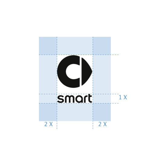
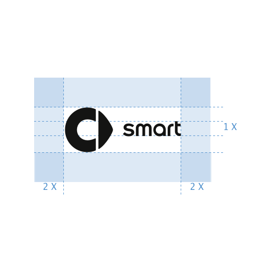
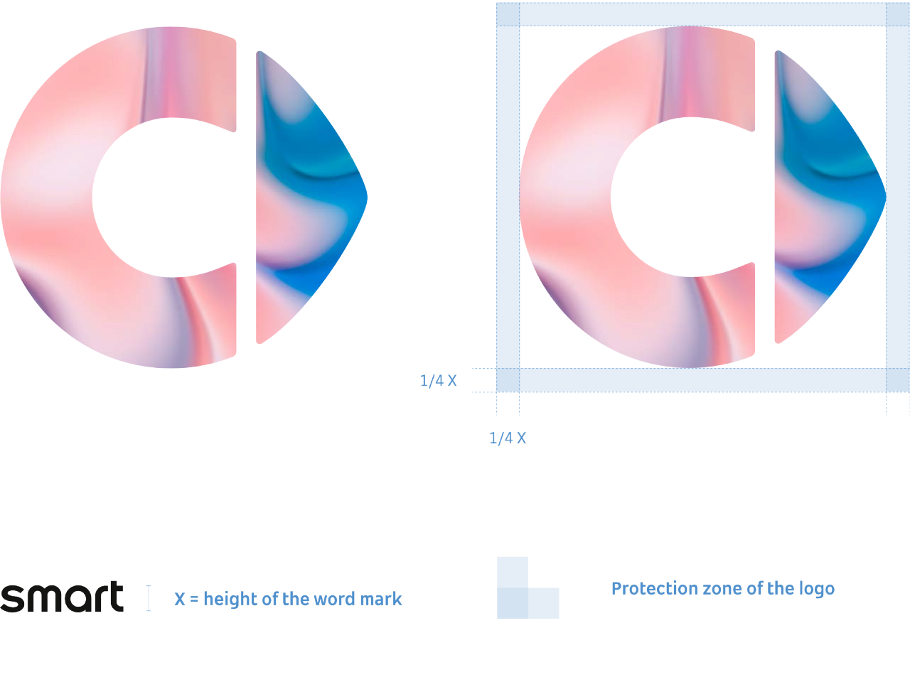
The logo is located in a protection zone, in which no other element may be placed. This zone also indicates the minimum distance between the brand and the format edges. The protection zone is defined by the outer edges of the logo plus 2 X, where X is the height of the word mark. All dimensions, proportions and minimum distances of the logo must always be considered. If the logo is separated and only the word mark or figurative mark is used, the protection zone of 2 X remains for both elements. 


Standard logo vertical

Logo horizontal

Figurative mark

Word mark


Special Cases

Detached logo

The logo can be used as a detached version only in digital applications where space is limited or as a phyiscal application on the car. Using the detached logo always is an exception to the defined logo usage rules. The word mark can be used on its own without showing the figurative mark. The figurative mark can only be used in a detached version, if the word mark is also visible in the same context and both can therefore be associated. 


Application areas
  • Digital: including but not limited to website (sticky header), APPs, in car UI/UX, social media, banner, etc. 
  • PowerPoint 
  • Physical: on the car only

Liquid logo

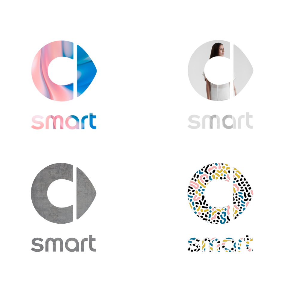
The logo offers maximum creativity and freedom within its form and can be filled with a wide variety of content. A liquid version of the logo can be applied wherever the brand wants to stand out from its environment and differentiate itself more distinctively. This includes digital applications and physical applications (e.g. trade fairs, events, sponsoring).


Rules

Figurative and word mark are used as a combination for the liquid version by default. This can be used in digital and non-digital media. When used as a liquid version, the logo must always be placed with the best possible contrast to the background.
If the figurative mark is used separately from the word mark in digital applications, the rules for the detached logo version apply. 

Possible fills

The logo can be filled in the digital or physical realm with: 

  • Videos
  • Animations 
  • Images 
  • Colors and patterns 
  • Materials and surfaces (for example metal, wood, velvet or plants) 

Protection area & distances – Liquid logo


Minimum distances

The logo can be used as a detached version only in digital applications where space is limited or as a phyiscal application on the car. Using the detached logo always is an exception to the defined logo usage rules. The word mark can be used on its own without showing the figurative mark. The figurative mark can only be used in a detached version, if the word mark is also visible in the same context and both can therefore be associated.


Positioning

The logo is always placed on a centered axis on the top of your choice of media. For minimal distancing around the logo the predefined logo protection zone applies to its positioning. Exact logo sizes and placement details for standard formats are specified and documented in the respective guidelines. For horizontal formats, the logo is placed on the central axis on the left-hand edge of the format. The only exception on standard formats is the application on business cards. For special formats such as interior signage, social media and PowerPoint templates, the logo can be placed differently.


Vertical Format

Dos
Donts

Horizontal format


Dos
Donts

Special format


Dos
Donts

Placement on surfaces and backgrounds


Logo positive

Placement on color

Consider light-dark contrast (All secondary colors can be used)

Placement on image

Consider light-dark contrast

Transparent logo on image

Maximum transparency of 65%


Logo liquid

Consider light-dark contrast

Logo negative

Logo negative on color

Consider light-dark contrast

Placement on image

Consider light-dark contrast


Transparent logo on image

Maximum transparency of 65%

Logo liquid

Consider light-dark contrast


Donts


No logo in the signature color

No colored logo on colored surface

No colored logo

No two-tone coloring


No 3D effects and no shadows

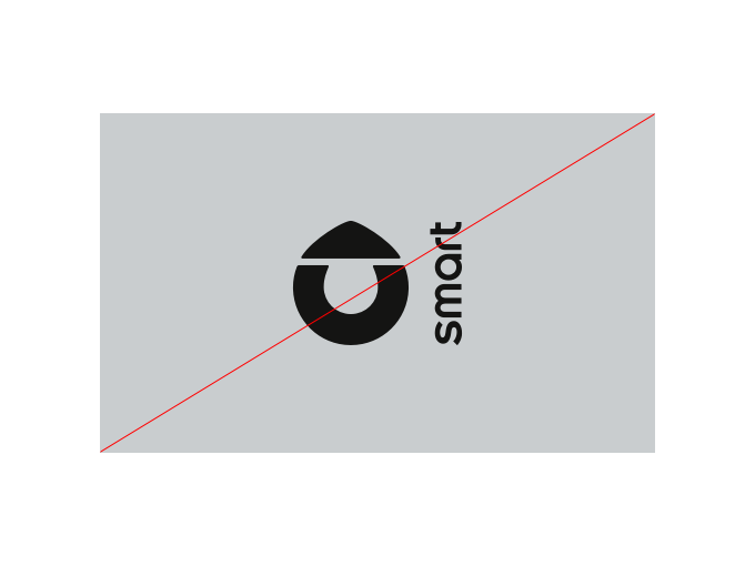
No rotation

No distortion

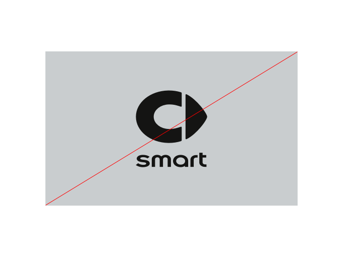
No new proportions or arrangements


Not cut or incomplete

No turbulent background

No additional elements

No random placement


Co-branding

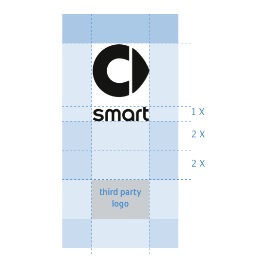
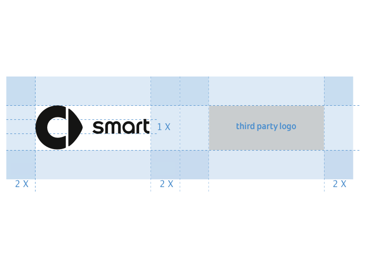
If other brands are presented in association with smart the positioning is clearly defined. The partner logo is always based on the height of the smart logo. There is a minimum distance of 4 X between the two logos. This is emphasized by a dividing line after 2 X. The dividing line always corresponds to the height of the smart logo. The standard vertical or horizontal version is used wherever possible. When applied vertically and smart is the primary sender, smart is always above the third-party logo. The horizontal logo should be applied when the media and spacing doesn‘t allow a vertical placement. 


Vertical (Standard logo)

Horizontal (Standard logo)

Horizontal (Special case)


These examples display the case when smart is the primary sender of the co-branding. As the primary sender the smart logo is always left-aligned. If smart is the secondary sender, the rules of the primary sender apply to the placement.


Nomenclature

All logo files in the database are structured according to a pre-defined nomenclature, which provides information on the variant, color space and file format of the respective logo.


Animation


Basic rules

The most important rules are summarized below:
Animation must not be changed.
The animation must always be shown in its entirety.
The transition between footage and brand animation can be done by cross-fades and soft overlaps or by a hard cut.
The speed of the animation must not be changed. A short version (4 seconds) and a long version (8 seconds) are available. The use depends on the total length of the video.
The animation sequence can take place on the smart black or be used transparently on the footage.
Sufficient contrast and image expression must be considered. 


Rationale

mart is a vibrant and dynamic brand. We set trends and lead the way and are the partner in everyday life and traffic as soon as you sit in the cock- pit. This positive mood of departure and start is reflected in the new brand animation for smart. Through the visual impulse, we signify movement, energy and progression. 

Fundamental

Brand animation can be used either starting or ending sequence of promotional or communicative moving images. The animation emphasizes the message and highlights the sender.


Animation sequence


Animation sequence (Motion)


Animation in 4 seconds. (Short version)

Animation in 8 seconds. (Long version)