Layout Principles


General

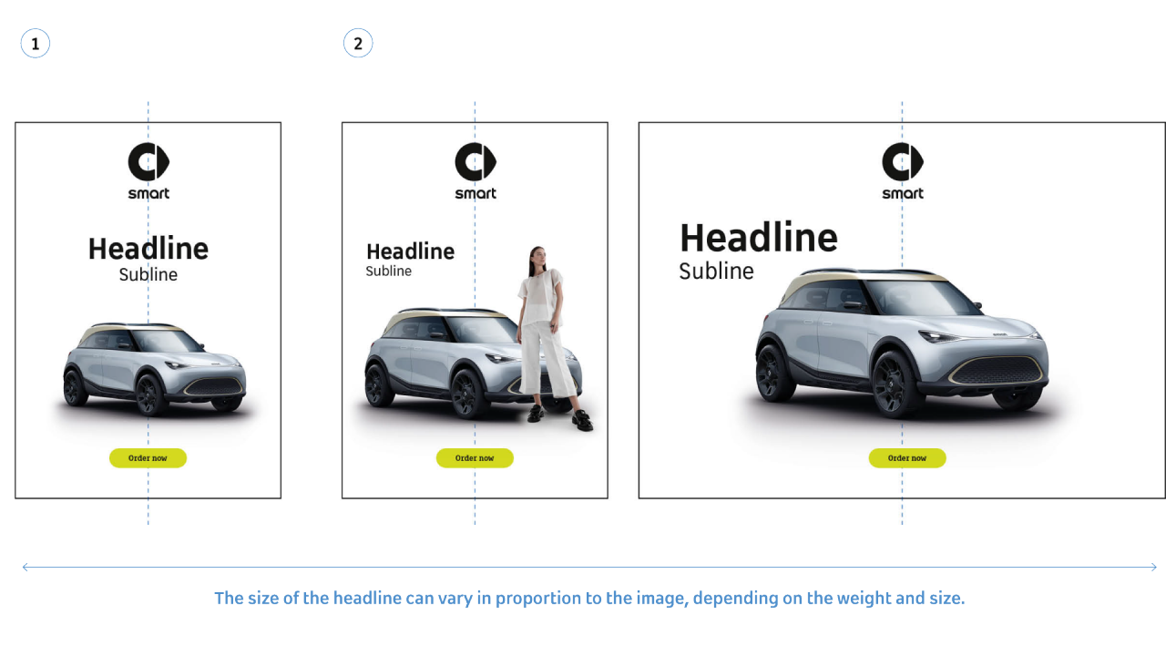
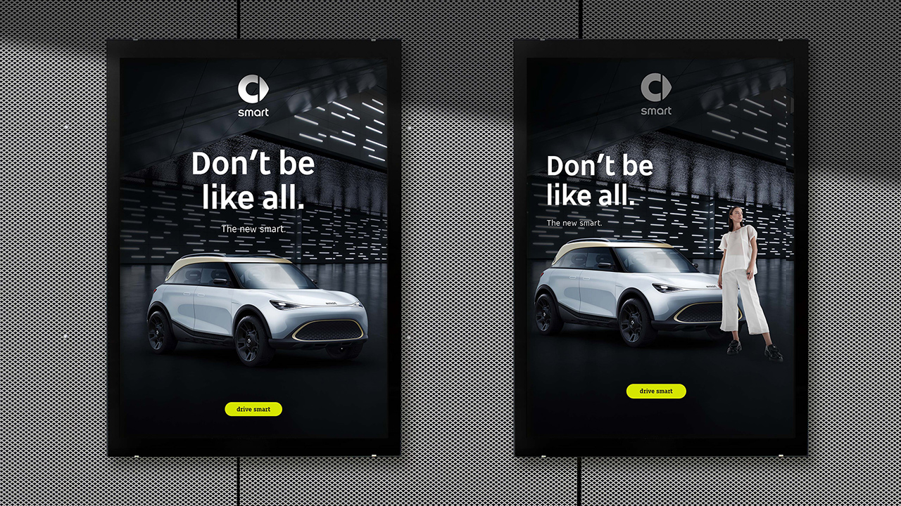
The layout rules are based on the defined basic principles and brand design elements. All elements are centered on the horizontal or vertical central axis. The focus of communication is always a message and the product (car). The car can stand alone or in combination with people. For more flexibility in the design, it is possible to choose between two types of behavior for the placement of headline and logo. 

Key Elements


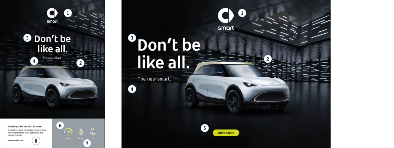
1 Logo

Centered (vertical center axis)

2 Car / Keyvisual

As much focus as possible

3 Headline

Two placement options (Centered / left-aligned)

4 Subline

Two placement options (Centered / left-aligned)

5 Call to Action

Centered (vertical center axis)

6 Brand icons

Communication / Illustratively simple

7 Background area

Communication area and highlights contents

8 Body text

Left-aligned with highlights


Headline Placement 

1 Headline centered 

If the headline is the key message of the communication, it is placed centered on the horizontal or vertical axis, between the logo and the focus of the image (car).The subline is centered below the headline. 

2 Headline left-aligned 

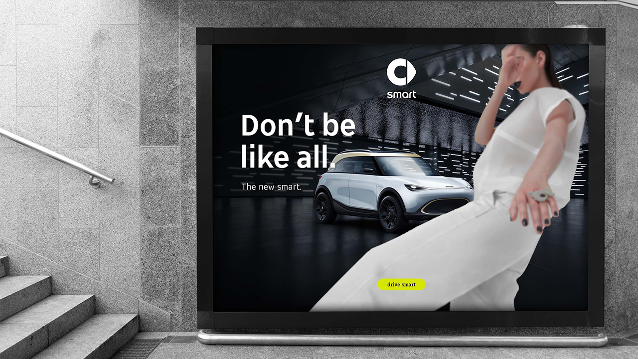
If the product (car) is the key message of the communication and therefore requires a more dominant overall space (see examples at item 2), the headline and subline can move to the left. In this case both - headline and subline - are positioned left-aligned. 


Examples in Use