The font FOR smart is our key brand identifier apart from our logo. Our font is the style-defining tool for all communication media. With the font tailored to our needs, we stand out and are recognised.

Fonts
General
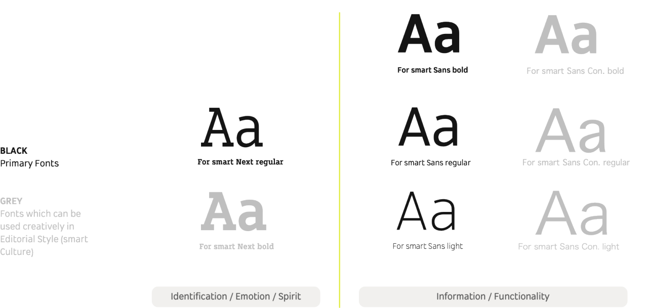
FORsmartNext,FORsmartSansWeb,FORsmartSans,FORsmartSansConWeb,FORsmartSansCon,TsangerYunHei(smart-corporate-font-chinese)
- Size:
- 23 MB
- Last modified:
- 17.01.2025
Variable Usage
To secure optimized typography use in every communication stage or use case we are able to choose within these options.
Hierarchy
Here we describe the overarching typography style hierarchy.
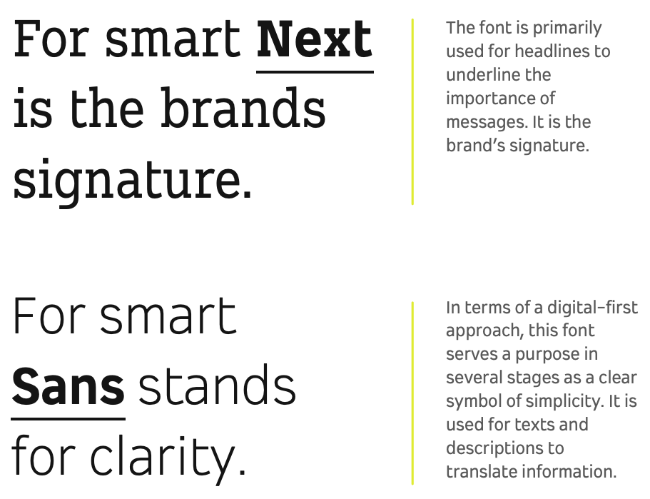
The 'For smart Next' is our main 'identifier' while the Sans is used when clarity is the primary objective.

Chinese Fonts
“仓耳云黑” is our official Chinese font and a key brand asset beyond the logo. It also serves as a defining stylistic tool across all communication platforms, making us distinctive and easily recognizable.

Chinese Font: Hierarchy
“仓耳云黑W07” is our primary signature typeface.For body text, where readability and clarity are the top priorities, please use “仓耳云黑W03.”

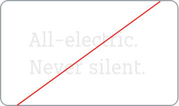
Misuse
No drop shadows
No unproportionate scaling
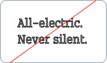
No outline
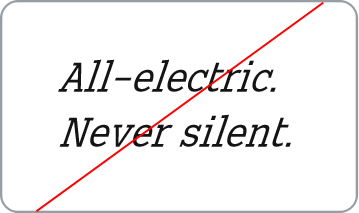
No italics

No reflection

No mirroring
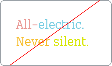
No multi-colors
No 3D effects
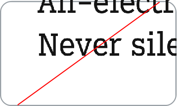
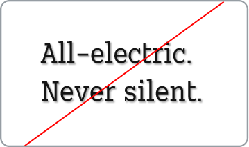
No cuts or incomplete
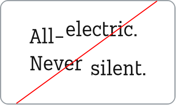
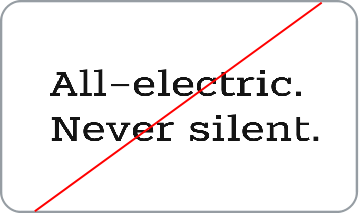
No shifted baseline