Here the 'FOR smart Next' is used for highest headline level only. We switch early to the 'FOR smart Sans' to support the functional nature of this channels / assets.

smart Core
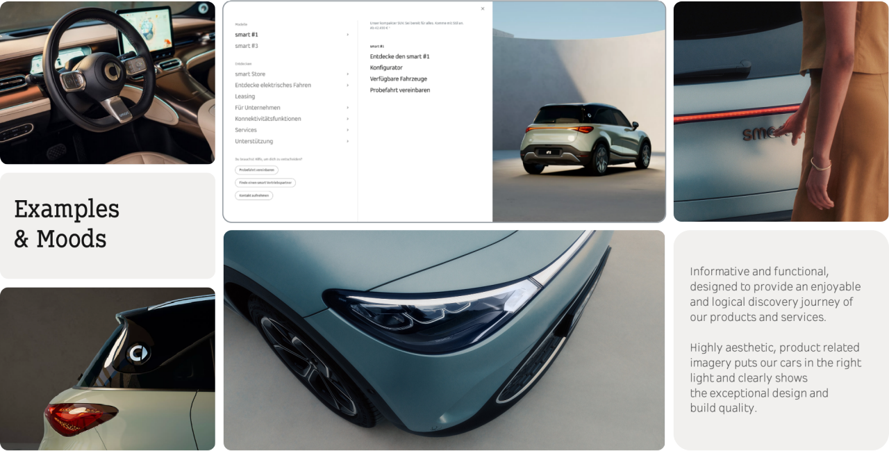
Examples & Moods
Function First
Product vs. Lifestyle
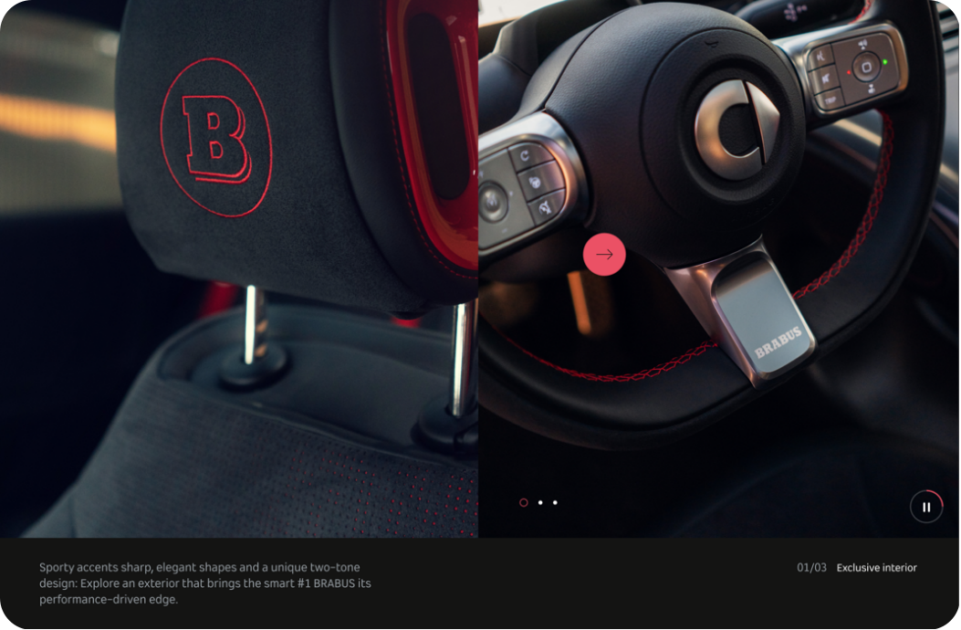
We evaluate exactly where to use imagery with and without people. Building an emotional bridge between image and copy is keyto create a logical and exciting discovery journey.
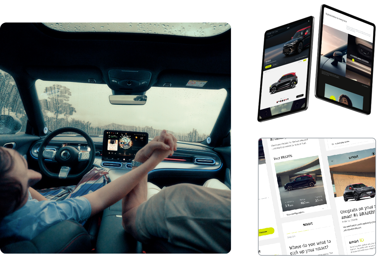
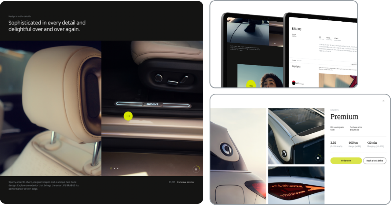
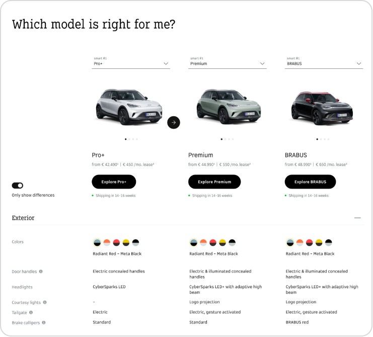
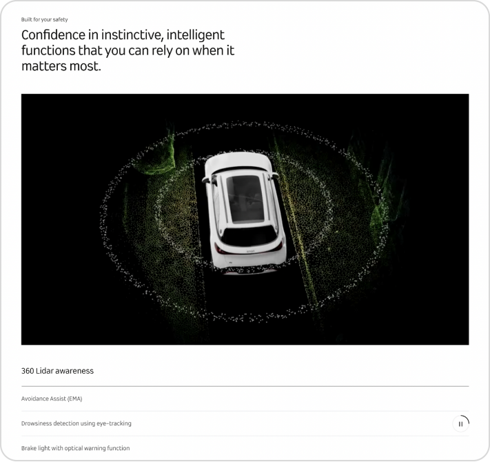
Structured Explanation
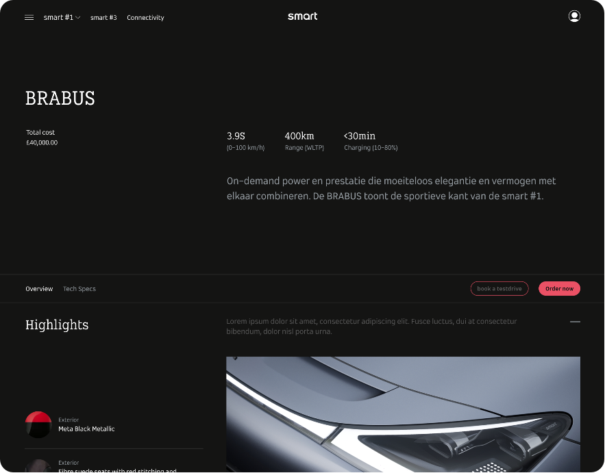
In the more tech and numbers related areas the imagery is reduced to allow for best possible support of more complex information.
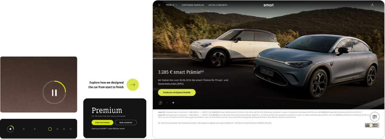
Just a touch of lime.
We use lime as the only accent color on core comms. BRABUS-only pages / assets are the exception. It is important to not overuse the color. These examples show the right balance.
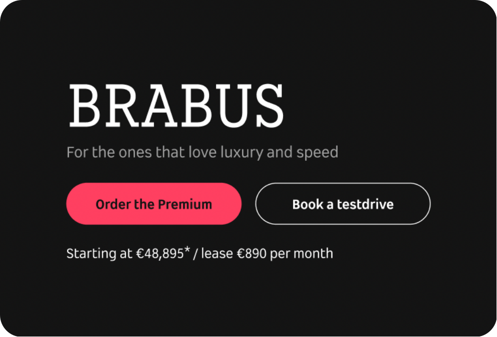
Red stands for BRABUS
A BRABUS page or BRABUS-specific newsletters are examples where BRABUS red should replace lime. This allows us to highlight the performance and luxury aspects of this particular line in an emotional way.
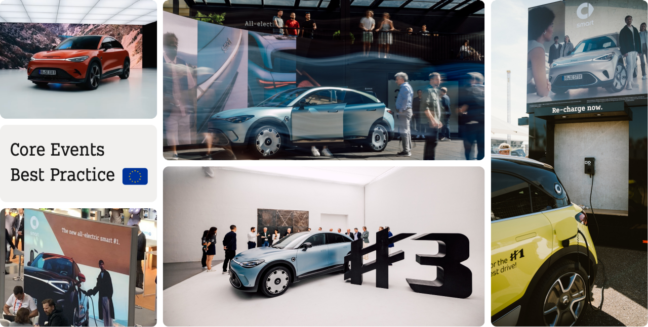
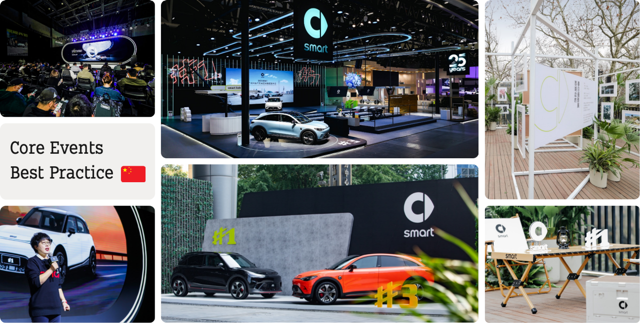
Best Practice