The primary colors of smart are based on the positioning and design vision. The brand’s signature accent color is electrifying lime. With this color, the brand will have an individual color tone that is not used by direct competitors. It is a bright yet striking color – natural and technical at the same time. It is fresh, optimistic and energetic. In BRABUS only communications, electrifying lime is replaced by BRABUS red.

Colors
Primary Color Spectrum

smart black
Used for Fonts,
Backgrounds
and UI Elements.
RGB 20.20.19
HEX #141413
CMYK 0.0.0.95
Special Colors
Pantone 419 C
HKS 88

smart white
Used for Fonts,
Backgrounds
and UI Elements.
RGB 255.255.255
HEX #ffffff
CMYK 0.0.0.0

smart electrifying lime
Signature color used
for Hover-Effects,
Interaction and Infographics.
RGB 215.230.0
HEX #d7e600
CMYK 20.0.100.0
Special Colors:
Pantone 389 C
HKS 69

smart BRABUS red
Replaces lime as accent
color in BRABUS only
communications / activities.
RGB 210.50.61
HEX #d2323d
CMYK 0.93.79.8
Special Colors:
Pantone 1797 C

smart grey
Used for Interactive
Elements, Backgrounds
and UI Elements.
RGB 89.89.89
HEX #595959
CMYK 0.0.0.65
Special Colors
Pantone Cool Gray 10 C
HKS 92 K

smart silver
Used for Fonts,
Backgrounds and
UI Elements.
RGB 150.157.163
HEX #969da3
CMYK 0.0.0.45
Special Colors
Pantone 877 C
HKS 99 K

smart light silver
Used for Backgrounds
and UI Elements.
RGB 223.226.229
HEX #DFE2E5
CMYK 3.1.0.10

smart light grey
Used for Backgrounds
and UI Elements.
RGB 242.242.242
HEX #F2F2F2
CMYK 0.0.0.5
Secondary Color Spectrum
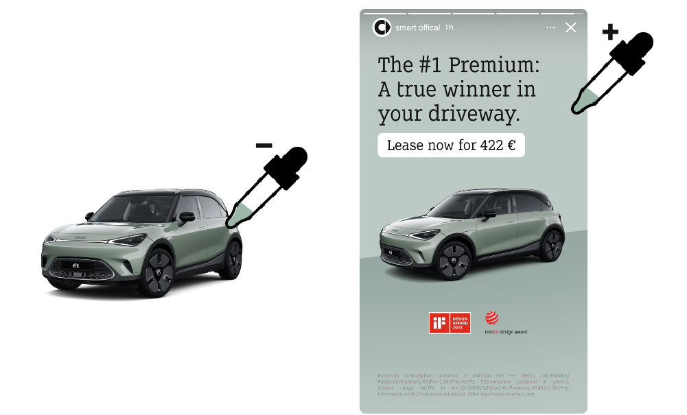
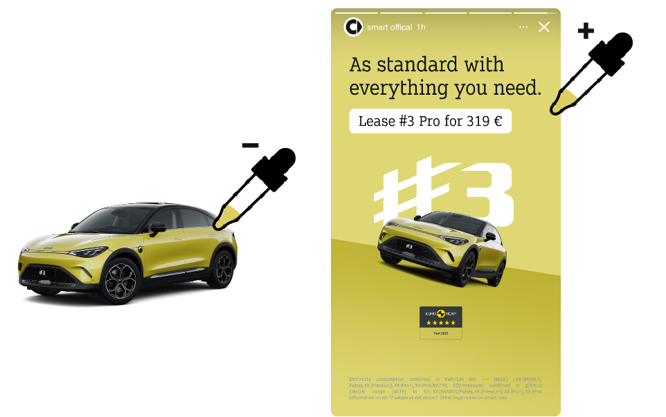
The secondary color spectrum is mainly used for two different purposes. The first scenario is where we use the colors to give more attention to sales push activities. Here the colors are derived from the vehicle colors.
Secondary Color Principle
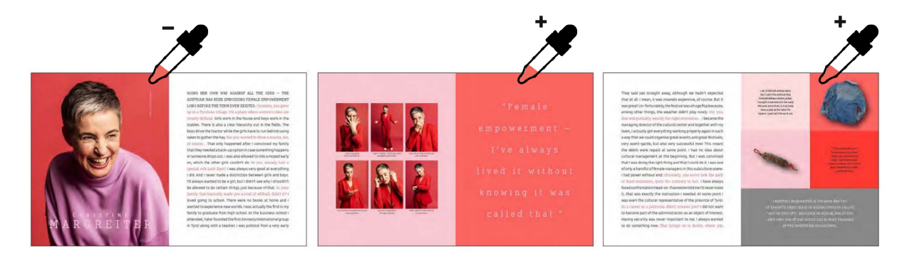
On the smart culture level (editorial) we can expand our palette to even more proud, self-confident, lively and mature colors. They should always be powerful, but not screaming. Never aggressive. We want color, but in a sophisticated way. Colors that bring positive energy and underline the character and styling of our content. Always go for a harmonious and premium look when choosing your colors.
Find below an example pallet:
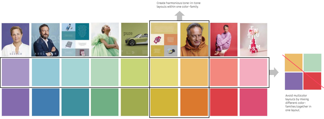
The colors used for backgrounds correspond to the colors within the photography or surrounding. This creates a harmonious and premium look. Combine one color-family with black or white. This visually holds storylines together.