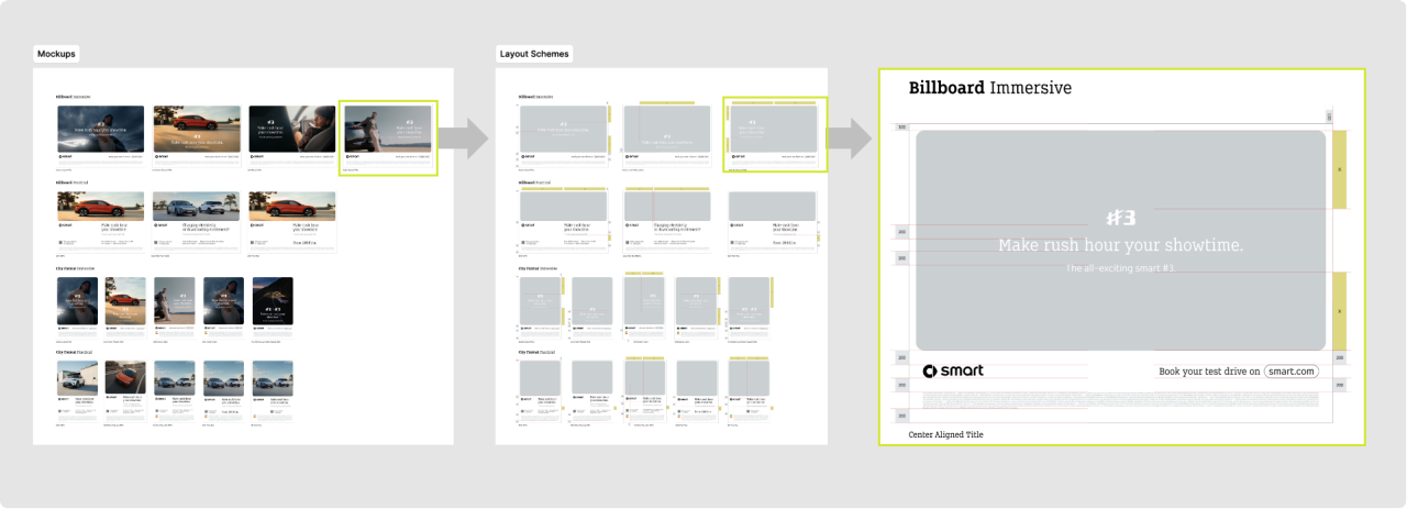
We have created templates for upper- and mid-funnel advertising, sales push campaigns, OOH and print formats. Choose a sample-layout. Find it´s corresponding template with guidance and adapt to your content.

smart Advertising
Design System & Templates
Digital Advertising
The advertising style of smart uses our identifier font 'FOR smart Next' for all headlines and CTAs.
In assets using white space the images have rounded edges and the animations are inspired by UI elements of the most common operating systems of mobile devices.
This results in a very organic feeling start of the mainly digital customer journey at smart.
TVC
During commercial breaks, the TV often becomes the second screen. With constant brand visibility we ensure that people can connect the message and story to our brand in every moment that they look at the screen. The same principle can also be applied in scenarios where this mechanic is beneficial (e.g. ads during concert breaks at festivals, 16:9 DOOH, etc.).
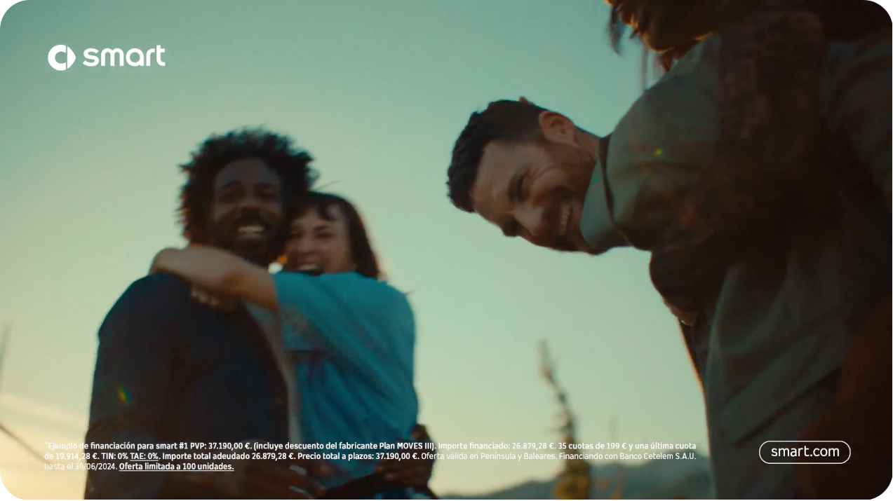
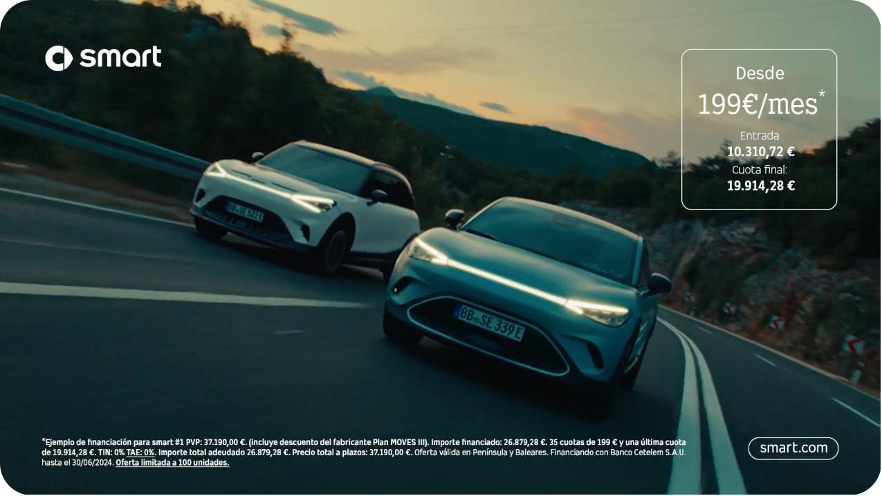
During the main part of the TVC constant brand visibility is achieved via horizontal logo and URL in the corners. Additional offers can be implemented.
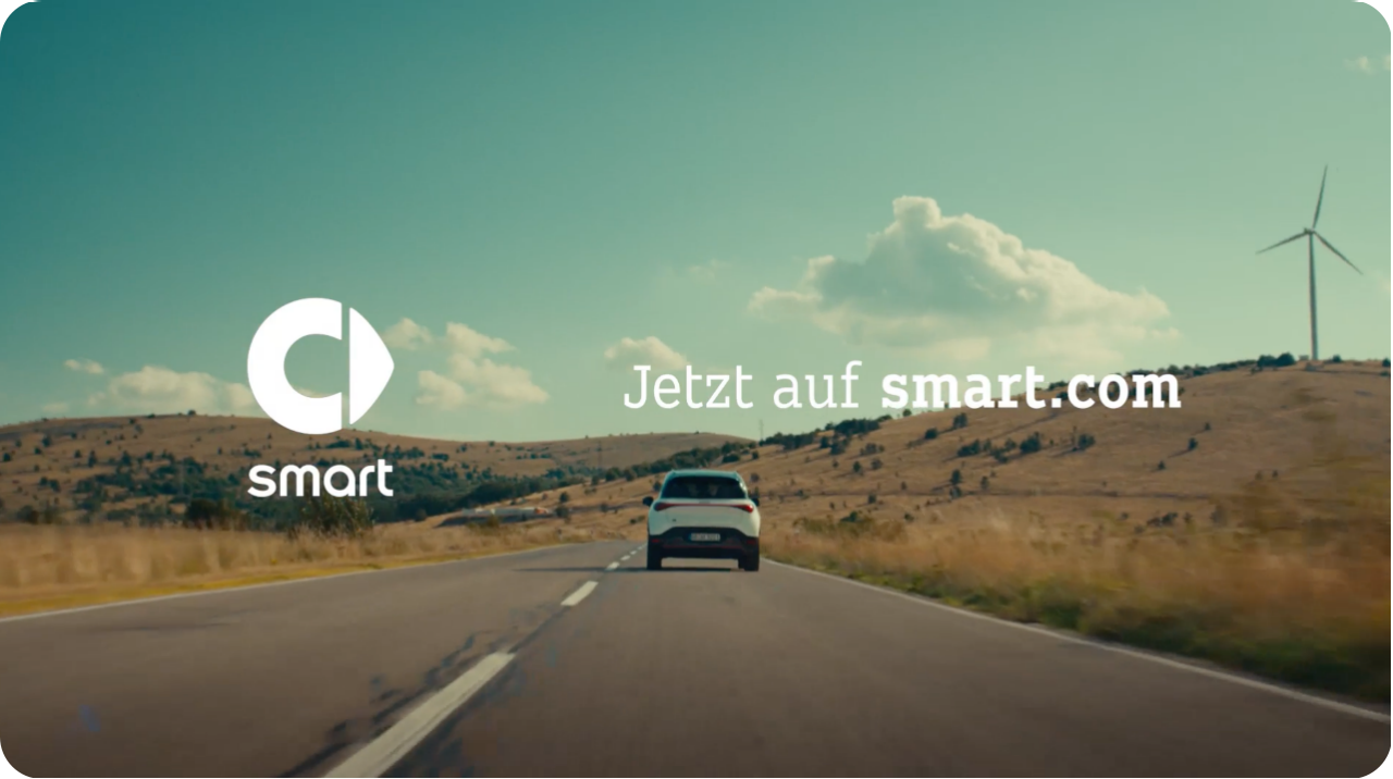
Logo animation on footage and CTA end the TVC on pack shot.
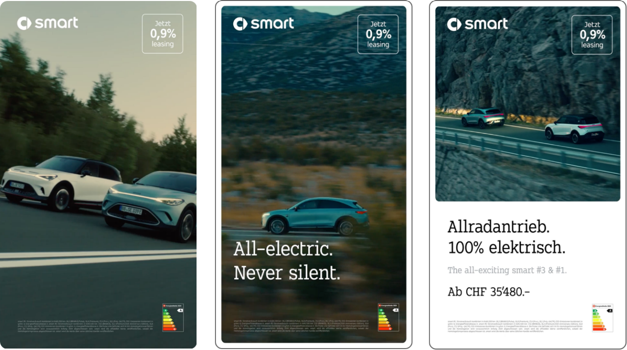
DOOH
For digital out-of-home we we utilise the same animation principle that we apply for animated banners. We start with full frame to ensure maximum impact of our visuals and then create more space for complex sales messaging.
We utilise the same positioning of the horizontal logo as in TVCs to ensure constant brand visibility.
Out-of-Home
Our digital-first aesthetics also expands into OOH advertising. The round edges with white space ensures recognizability. We have layouts with more space for strong imagery (immersive) or versions where the headline and information about our products / services have enough space to convince our audience (practical).
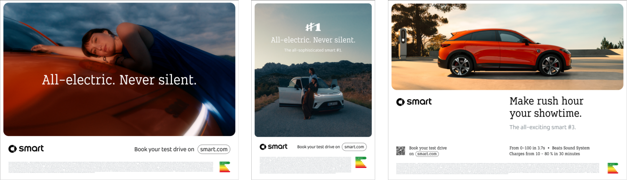
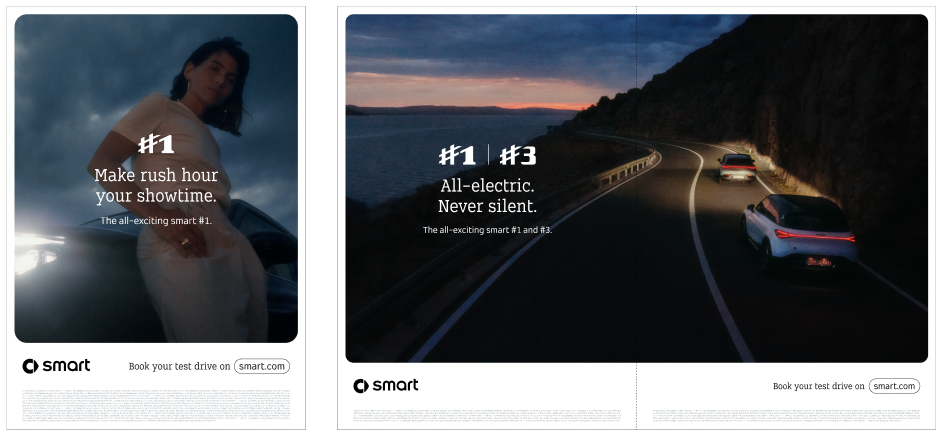
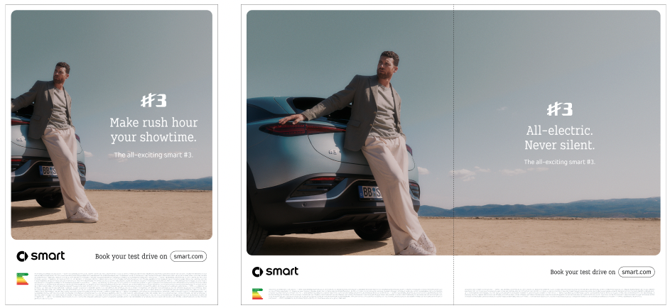
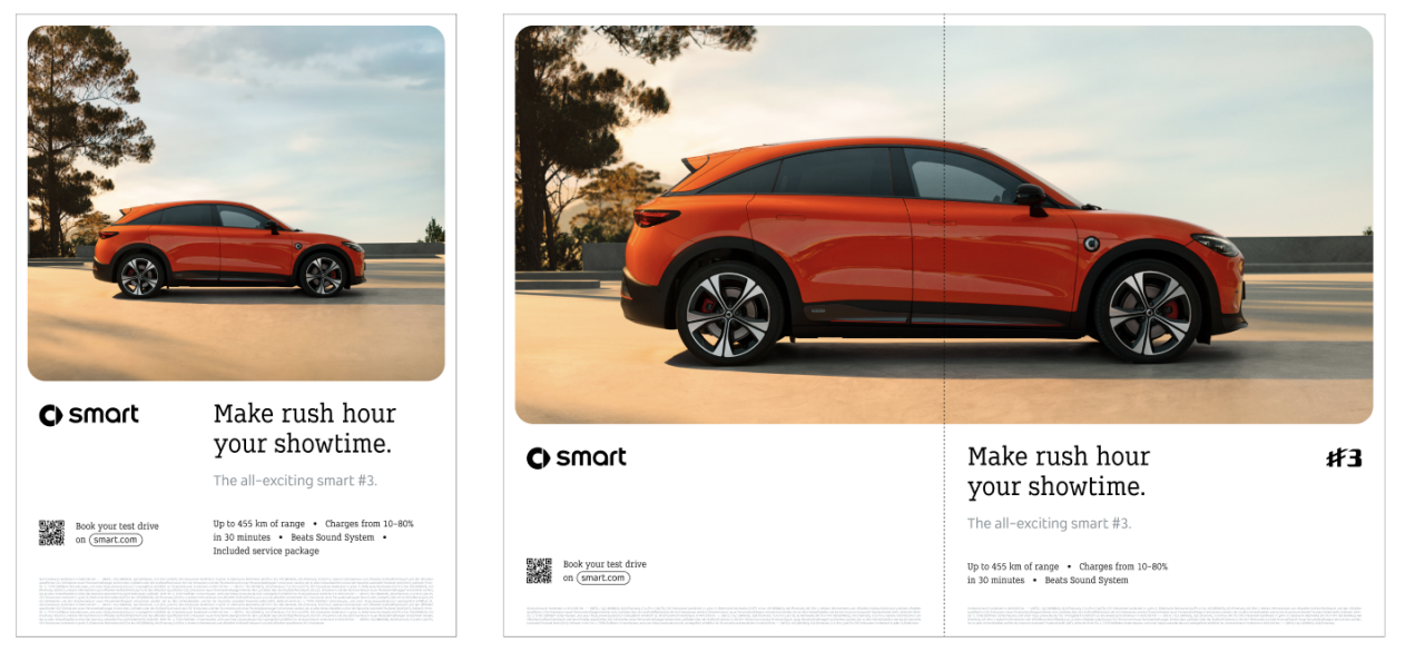
Print 'Immersive'
The same rules for OOH apply also in print. Here the picture frame with its round edges and typography elements need, in case of a double spread, a safe zone in the fold to ensure a consistent look in the printed end-result. Also, here the layout can vary based on the needs. We have 'immersive' option, focusing on brand messages…
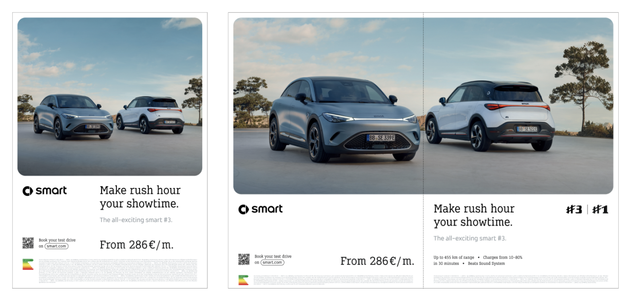
Print 'Practical'
….and practical versions with focus on information about our products / services.The relation between image and text areas can be adjusted based on the amount of text needed (headline, sub-headline, additional RTBs or copy, price & disclaimers).
Sales Push (paid social and paid media only)
Our sales push layer allows us to put a lot of attention on a specific offer. Our flexible templates allow for a lot of copy and the creative usage of CGI machine exports. In this layer we obviously write in our brand tonality, but we do not write brand messages. We focus on the 'reasons to buy' and highlight prices as well as special offers. Use of 'third party validators' is encouraged.
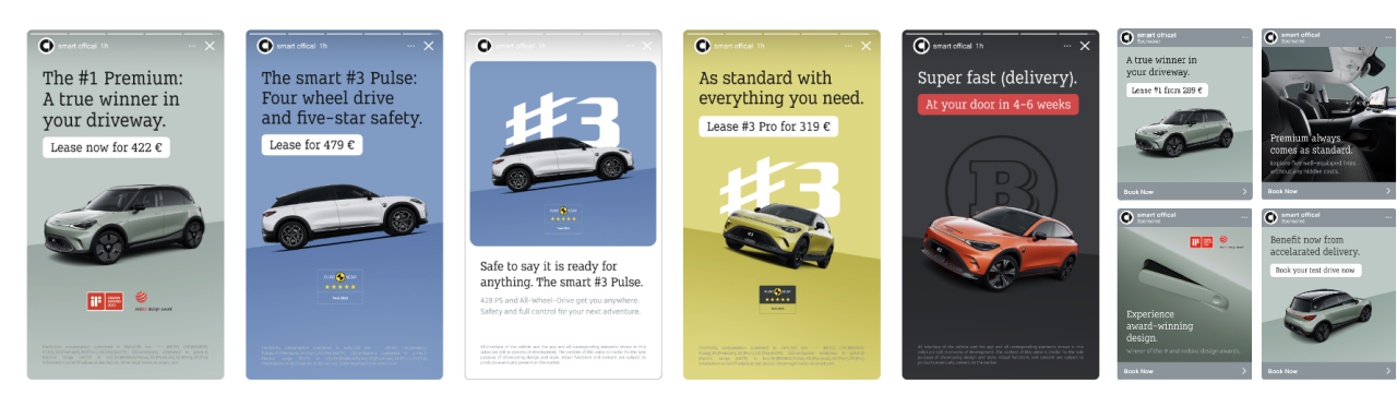
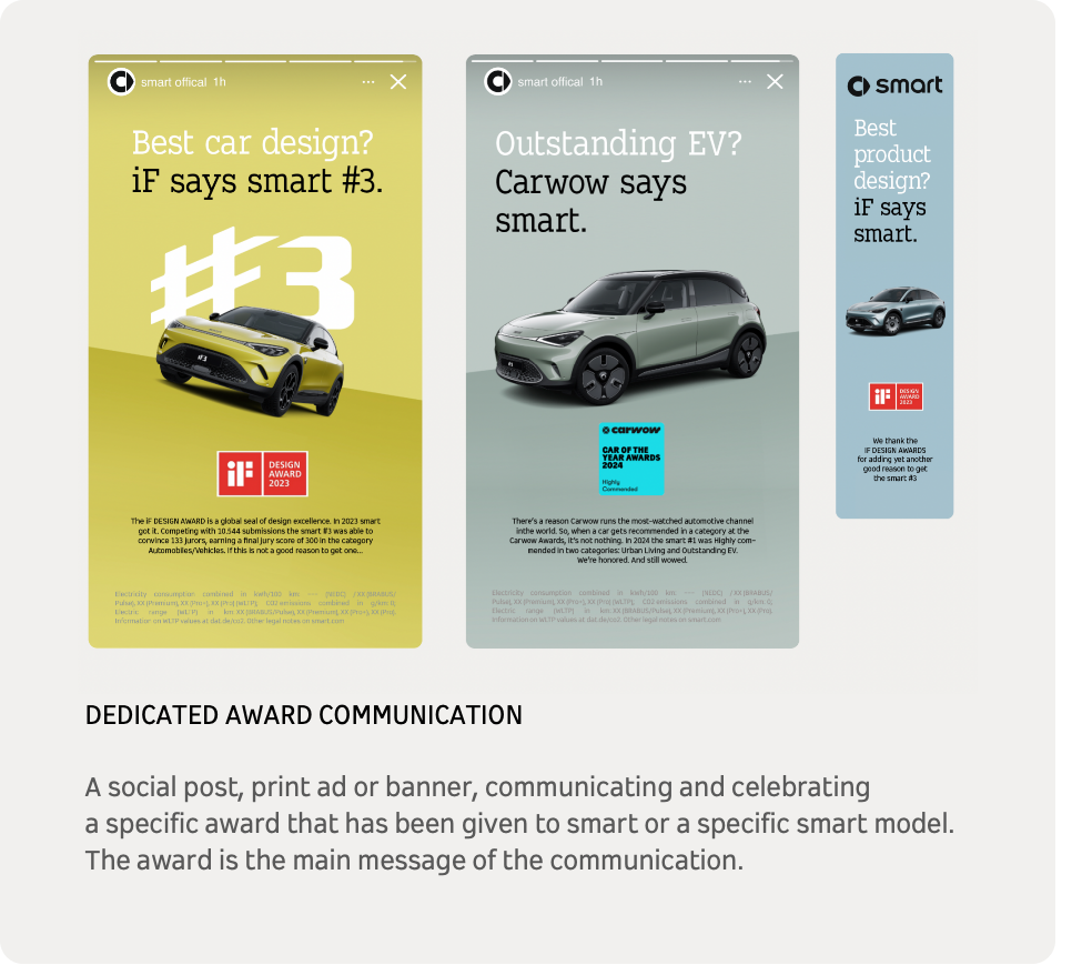
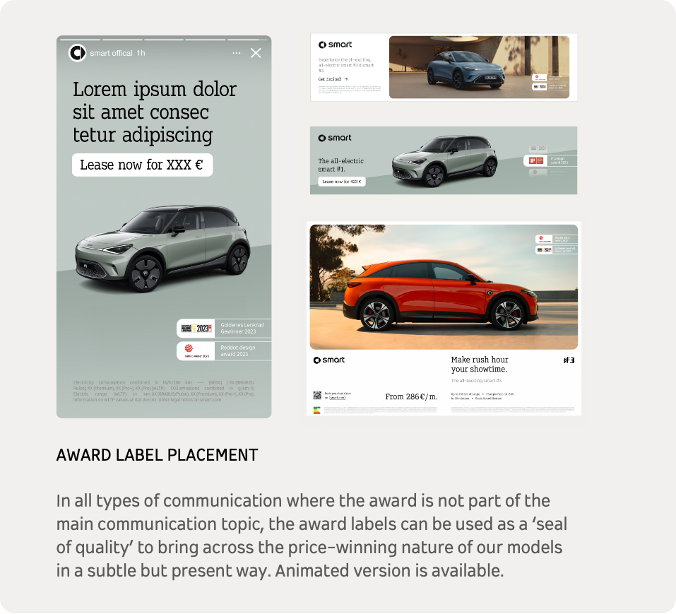
Sales Push, Print and OOH: Award Integration